

How to create a reusable menu component in React
Reusable dropdown menu component with popper engine and React


Dropdown menus have always been an integral part of any modern UI for a better user experience throughout an app. Dropdown menus are essential for a clean design layout where user actions can be organized for easy accessibility without cluttering the UI.
Note: We will be covering a few advanced concepts of React. So having intermediate knowledge of React is advisable.
Let's look at what we will be building. You can check out the below codesandbox for complete code and file structure.
Requirments
We want our Menu component to be robust so it can be reused without breaking the existing Ui layout. Let's set some requirements before we start digging into the code.
- A dropdown trigger (Button) to toggle between opening or closing the dropdown.
- A dropdown component will open or close based on the trigger state.
- Dropdown list position can be configured for the different use cases.
- Dropdown needs to be responsive depending on the viewport space.
- Dropdown should close if clicked any list items.
- Ease of reusability anywhere. (No need to manage state outside of the component)
- Styles can be customized easily.
Well now we have defined our requirements, let's break the Ui elements into different components based on our requirements.
- Dropdown Trigger - A button component that will be used to show or hide the dropdown. Let's name it
MenuButton. - Dropdown container - A dropdown component that will contain the list items. This one we will call
MenuDropList. - Dropdown items - A single list item component for ease of rendering multiple at once and easy customization. Let's name it
MenuListItem. - Last but not least, a wrapper parent component to manage the dropdown menu state and other functionality. we can imagine it as the brain of all the components combined. Let's call it
Menu.
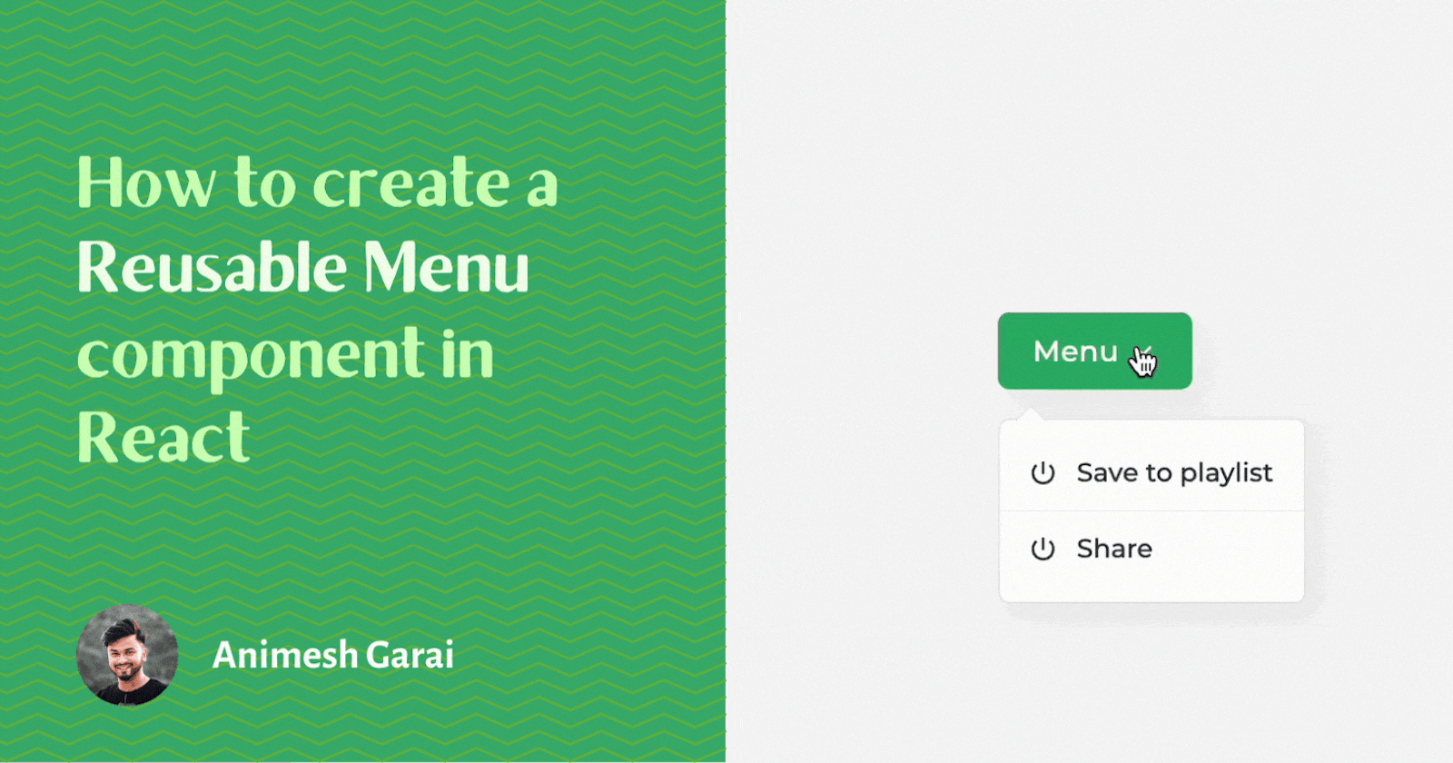
Okay, We've named all the components and laid out the plan. Now let's visualize the component tree -
<Menu>
    <MenuButton>Menu</MenuButton>
    <MenuDropList>
        <MenuListItem>Show playlist</MenuListItem>
        <MenuListItem>Share post</MenuListItem>
    </MenuDropList>
</Menu>
Packages
Before we start diving into building the components let's look at all libraries we will need while building those components and why.
@popperjs/core,React Popper- We will use the popular positioning engine, Popper, to position ourMenuDropListcomponent dynamically based on the position of theMenuButtoncomponent. You can read more about its features from here.classnames- A simple JavaScript utility for conditionally joining classNames together.sass- To organize our CSS in a better way.
Note:
classnames&sassis optional. If you don't want to use any one of these you remove those from the below command while installing packages.
npm install @popperjs/core React Popper classnames sass
Now it's time to build 🚀
Well, let's start building each component one by one from the basic setup. As we progress will add complexity.
MenuButton Component
// components/Menu/MenuButton.js
import { forwardRef } from "react";
import styles from "./Menu.module.scss";

const MenuButton = forwardRef(
  (
    {
      children,
      menuToggle // function to open close menu
    },
    ref
  ) => {
    const handleButtonClick = () => {
      menuToggle();
    };
    return (
      <>
        <button className={styles.button} ref={ref} onClick={handleButtonClick}>
          {children}
        </button>
      </>
    );
  }
);

MenuButton.displayName = "MenuButton";

export default MenuButton;
We have created a basic MenuButton which renders a button element and its onClick action is passed down as a prop menuToggle. The component is wrapped around forwardRef so that we can pass ref from the parent and attach it directly to the button element.
We are also setting the displayName of the component to - "MenuButton".
If you don't have any knowledge about
forwardRefplease go through the doc
MenuButton can be used as below -
<MenuButton menuToggle={() => console.log("Hello World!")}>Menu</MenuButton>;
MenuListItem Component
// components/Menu/MenuListItem.js
const MenuListItem = (
  {
    onClick, // Click function for list item
    closeMenu, // Function to change menu state to false
    className,  // Menu state true || false
    children // User defined className
  }) => {
  const handleListItemClick = () => {
    onClick && onClick()
    closeMenu()
  };

  return (
    <li className={className} onClick={handleListItemClick}>
      {children}
    </li>
  );
};
MenuListItem.displayName = "MenuListItem";

export default MenuListItem;
Now we have a list item component that will render one li element. This component accepts three props.
onClick- We can pass the onClick function directly to the component.closeMenu- A function passed down from the parent which changes menu state to false.className- We can pass classes to directly customize its style keeping the reusability requirement in mind.
The component is also wrapped around forwardRef and displayName of the component is also set as - "MenuListItem". we will see how this is helpful while we progress more.
MenuDropList Component
// components/Menu/MenuDropList.js
import { cloneElement, forwardRef } from "react";
import styles from "./Menu.module.scss";
import classnames from "classnames";

const MenuDropList = forwardRef(
  (
    {
      className, // User defined className
      children, // MenuItem children
      menuState, // Menu state true || false
      closeMenu, // Function to change menu state to false
    },
    ref
  ) => {

    const classNames = classnames(className, styles.container, {
      [styles.open]: menuState
    });

    return (
      <div
        ref={ref}
        className={classNames}
      >
        <ul>
          {children.map((child, i) => {
            if (child.type.displayName === "MenuListItem")
              return cloneElement(child, { closeMenu, key: i });
          })}
        </ul>
      </div>
    );
  }
);

MenuDropList.displayName = "MenuDropList";

export default MenuDropList;
MenuDropList is a ul element that will wrap around only li elements, in this case, MenuListItem.
To validate MenuDropList component has only MenuListItem as its children, we will verify every child element's displayName property.
So now if child displayName matches with MenuListItem we will pass down the closeMenu function which is passed from the parent. To do that we will use cloneElement function from React.
cloneElement is part of the React Top-Level API used to manipulate elements. It clones and returns a new element using its first argument as the starting point. we can also pass new props to the cloned element.
So here we are mapping over every child and passing down the closeMenu function to every MenuListItem so that each MenuListItem onClick triggers the menu state to false and hides the MenuDropList component.
Now let's talk about how to show and hide the MenuDropList component. There are many ways we can do this but for simplicity, we will use CSS to do the job. We will just add open class to ul element if menuState is set to true.
Great! we have built the basic components. Now let's look into the styles before we start building the brain of all the components.
Styling with CSS
// components/Menu/Menu.module.scss";
.container {
  display: none;
  width: max-content;
  border-radius: 6px;
  border: 1px solid #e3e3e3c7;
  background: #f0f0f0;
  box-shadow: 5px 5px 15px #0000000d;
  min-width: 10rem;

  &.open {
      display: block;
  }

  ul {
      list-style: none !important;
      padding: 0.5rem 0 !important;
      margin: 0 !important;
      position: relative;
      z-index: 2;
      li {
          padding: 0.5rem 0.8rem;
          cursor: pointer;
          font-size: 0.85rem;
          font-weight: 500;
          display: flex;
          align-items: center;
          gap: 0.5rem;
          transition: 0.2s;
          &:not(:last-child) {
              border-bottom: 0.5px solid #e3e3e3c7;
          }
          &:hover {
              background: #f7f7f7;
          }
      }
  }
}
Here is one thing to note MenuDropList has display: none set initially. Based on the menu state will add the open class to change display property.
Menu Component
Inside the menu component, will manage the internal state for the dropdown, and from here we will pass necessary functions and states along to its children.
Let's look at what needs to be passed down to which child component:-
MenuButtonneeds themenuTogglefunction as a prop to togglemenuStatebetween true or false state.MenuDropListneedsmenuStateand acloseMenuprop which will update state to false.
First, we will define a menuState using useState to manage our dropdown state, Then just like we have built MenuDropList before, we will use cloneElement function and displayName to share props among the children . Based on the displayName value we will clone the component and pass down the above-listed props.
// components/Menu/Menu.js
import { cloneElement, useState } from "react";

const Menu = ({ children }) => {
  const [menuState, setMenuState] = useState(false);

  return (
    <>
      {children.map((child, i) => {
        const displayName = child.type.displayName;

        if (displayName === "MenuButton") {
          return cloneElement(child, {
            menuState,
            menuToggle: () => setMenuState((prev) => !prev),
            key: i
          });
        } else if (displayName === "MenuDropList") {
          return cloneElement(child, {
            menuState,
            closeMenu: () => setMenuState(false),
            key: i
          });
        } else {
          return null;
        }
      })}
    </>
  );
};

Menu.displayName = "Menu";

export default Menu;
If you have followed up till now, you should have a somewhat functioning dropdown component but we are not there yet. We haven't positioned our MenuDropList component according to our MenuButton. Let's do that next.
Setup popper
Let's understand what is popper and how to work with it. We will not cover in-depth about it here, maybe a simple crash course. You can check out its documentation for more details.
Popper is nothing but a positioning engine that will help us position our MenuDropList on the UI.
To setup popper, it needs two things -
- Target - A target element that will be absolutely positioned on the viewport. In our context, we will call it
menuListElement. - Anchor - An element based on which position in the document flow the target element will be absolutely positioned around it. In our context, we will call it
menuButtonElement.
So we want the MenuDropList component to be positioned depending on MenuButton position. Let's modify the Menu component now.
// components/Menu/Menu.js
import { cloneElement, useState } from "react";
import { usePopper } from "react-popper";

const Menu = ({
  children,
  menuPlacement = "bottom-start", // popper input for menu position
  offset = [0, 15]
}) => {
  const [menuState, setMenuState] = useState(false);
  const [menuButtonElement, setMenuButtonElement] = useState(null);
  const [menuListElement, setMenuListElement] = useState(null);
  const {
    styles: { popper: popperStyles },
    attributes: { popper: popperAttributes },
    update
  } = usePopper(menuButtonElement, menuListElement, {
    placement: menuPlacement,
    modifiers: [
      {
        name: "offset",
        options: {
          offset
        }
      }
    ]
  });
  return (
    <>
      {children.map((child, i) => {
        const displayName = child.type.displayName;

        if (displayName === "MenuButton") {
          return cloneElement(child, {
            menuState,
            menuToggle: () => setMenuState((prev) => !prev),
            ref: setMenuButtonElement,
            key: i
          });
        } else if (displayName === "MenuDropList") {
          return cloneElement(child, {
            menuState,
            closeMenu: () => setMenuState(false),
            ref:  setMenuListElement ,
            popperStyles,
            popperAttributes,
            key: i
          });
        } else {
          return null;
        }
      })}
    </>
  );
};

Menu.displayName = "Menu";

export default Menu;
A lot has changed in the Menu component, let's break it down. First, we have initialized two more states using useState for our anchor and target element. we will pass its set methods as ref to their respective child.
Note: For storing the DOM elements we need to use
useStatehere instead ofuseRef. the component needs to rerender once the ref DOM element is set so that popper can re-calculate its position.
Then we imported usePopper hook from "react-popper" and initialized it with our anchor and target element with a few configurations. That's it! we now have a fully reusable menu component that can be used anywhere.🎉
If you want a version of this with an arrow you can visit here. This is a react component library that I'm working on.
We have implemented some advanced concepts of React while building these components. Hope this helped you understand how to build compound components. Thank you so much for sticking with me till the end. If this blog helped you then do drop your favorite reaction(s) and let me know what you liked or any feedback you want me to work on.